
At the end are the two videos on how to produce a Guttman Chart in both Sheets and Excel.
Guttman charts are excellent ways to pull a tonne of data out of individual assessment tasks. Data that benefits the students individually, as a class and to inform teaching practice. Data from Guttman Charts are easily accessible and visible graphically.
Guttman charts will help you:
- Produce a roadmap for student remediation.
- Visualise the student and cohort zones of proximal development.
- Reflect on your teaching – how well all concepts were covered.
- Obtain objective information on how difficult items in your assessment task were compared to your intuitive “feeling” as you wrote them.
The two videos below will go through how we put them together (comment below if you can tell me which one was done at 11 pm and which one was done at 11 am).
Pushing my agnosticism
This is the first time in a long time that my agnosticism to technology has been drastically pushed. Both produce excellent charts but the slightly limited functionality (or at least more difficult to use – and not in a fun nested formula way) of Google Sheets compared to Excel made this significantly longer to put together; the whole chart after data entry would take me 10 minutes in Excel and 15 or so in Sheets.
Favourite formula in the Chart
My favourite formula in the chart was quite incidental to the actual chart but it was fun to put together and adds an extra level of analysis.


This nested IF formula allows the viewer of the charts to quickly see which components/questions of an assessment task are strengths (denoted by an “S”) or are weaknesses (denoted by a “W”). Questions that were neither strengths nor weaknesses (based upon our arbitrary definition) are denoted by a SPACE (see ” “). These aren’t blank cells. The fixed cell ranges in COUNTA give us the total possible score in cell C27, as the Standardised Score is a function of the total students in the group.
This could have been done with an IFS formula – which is cooler btw – but that’s only available for Excel in the 2019 for O365 version.
What do the Charts look like?

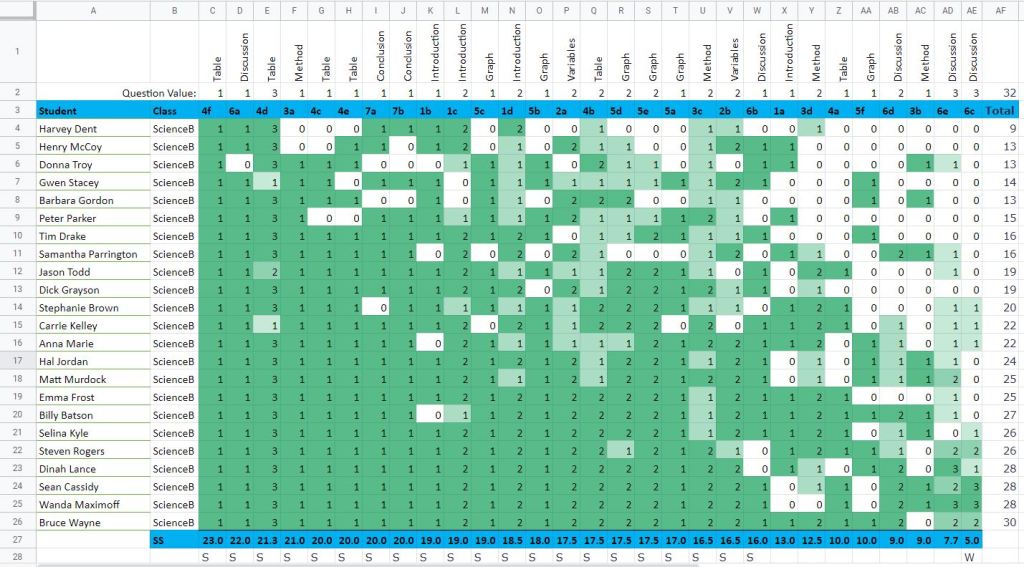
These two charts – 1st from Excel and 2nd from Sheets – are created using the same Mock Data.
Differences in production include the ability to sort via columns AND rows in Excel while Sheets can only sort easily by rows, and the usage of the conditional formatting is a little more flexible and easy with Excel. We could have gone traffic light colours using Sheets but it would have resulted in extra steps that I wasn’t keen on demonstrating (the video was already getting long).
Guttman Tutorials
Thanks for following along, I hope this helps. Give the channel a subscribe – it makes it easier to keep going the more people that come along with us. Follow along on Twitter and again see if you can work out which one was done at 11 am and 11 pm!
Thanks,
Pete
